Showing posts sorted by relevance for query irwin. Sort by date Show all posts

Jul 21, 2008

seeing is forgetting the name of the thing one sees

i've been trying to get a copy of lawrence weschler's wanderer in a perfect city for at least a year; the san francisco library had one copy (always on loan), and the pitkin county library is sadly deficient. beggars not being choosers, instead i took out a copy of weschler's biography of robert irwin, the west coast avant garde painter and engulfed it in just a few nights of reading. much of weschler's description of irwin's work over the last half-century reminded me of bench scientists and their relentless pursuit of resolutions to hypotheses (a psychotherapist in one of the painting workshops agreed with me)  a sort of a research and development undertaking applied to art. not coincidentally, there is a fine art research and development program at the swedish royal academy of art.

Had one asked Irwin in 1965 how he viewed the relationship between his activity and that of a scientist, he might well have replied that he saw none whatsoever, or that he saw the two enterprises as diametrical opposites. By 1970 .. he had developed a rich sense of the interpenetration of the two endeavors. "Take a chemist, for example, he starts out with a hypothesis about what might be created if he combined a few chemicals, and he begins by simply doing trial and error ... What the artist does is essentially the same. In other words, what you do when you start to do a painting is that you begin with a basic idea, a hypothesis of what you're setting out to do ... It's just a million yes-no decisions. You try something in the painting, you look at it, and you say, 'N-n-no.' You sort of erase it out, and you move it around a little bit, put in a new line; you go through a million weighings. It's the same thing, the only difference is the character of the product. Let's say at a particular point the scientists gets what he set out to get, he arrives at what he projected might happen if he mixed the particular right combination of chemicals in the right way. But the same thing is true of the artist: when he finally gets the right combination, he stops, he knows he's finished.
most rewarding were the many accounts of the extensive process underlying the final objects irwin produced (the line and dot canvases, the discs, the glass and acrylic monoliths, etc)  it validates the need to tool about in the shop or studio concentrating on process rather than product and figuring out what questions to ask and how to frame them. (production furniture is nearly, but not quite, the antithesis of a question-orientation).
There is a strain in the Jewish mystical tradition that asserts that there exist questions larger than the sum of their answers, questions all of whose possible answers would never exhaust them ... "The thing that really struck me the most as I got into developing my interest in the area of questions is the degree to which as a culture we are geared for just the opposite. We are past-minded, in the sense that all of our systems of measure are developed and in a sense dependent upon a kind of physical resolution. We tag our renaissances at the highest level of performance, whereas it's really fairly clear to me that once the question is raised, the performance is somewhat inevitable, almost just a mopping-up operation, merely a matter of time. Now, I'm not antiperformance, but I find it very precarious for a culture only to be able to measure performance and never to be able to credit the questions themselves."
the constant pursuit of a goal which cannot be realised in the coarse stuff of the world is heroic, like trying to capture the meaning of a Dreaming without the right song, or trying to produce a 3D version of a 4D shape.
frank stella: "I always get into arguments with people who want to retain the old values in painting -- the humanistic values they always find on the canvas. If you pin them down, they always end up asserting that there is something besides the paint on the canvas. My painting is based on the fact that only what can be seen there is there ... If the painting were lean enough, accurate enough, or right enough, you would be able to just look at it ..." karsten harries, commenting on stella: "No matter how radical the pursuit of presence, the work of art will always fall short of that purer art that is its telos. It points beyond itself and lacks the plenitude it demands."
the nice thing is, sometimes the heroic endeavor is rewarded, though not because but in spite of the trying.
Grace: you work and you work and you work at something that then happens of its own accord. It would not have happened without all that work, but the result cannot be accounted for as the product of the work in the sense that an effect is said to be the product of its causes. There is all that preparation  preparation for receptivity  and then there is something else beyond that, which is gratis, for free.
last week, paul bowen took a pencil and drew a smiley face on a sheet of butcher paper and it had the most perfect line. he tried to replicate it and was unable to; we ended up tracing over it to produce a pale shadow of the original. but perfect lines are the result of this kind of beginner mind or state of grace, where consciousness recedes in the act of creation.

to really see is to penetrate through to the meaning-essence of the thing seen, to enter a state where the name of the thing becomes irrelevant, where the sign is replaced by the signified: forgetting the name of the thing one sees.

Aug 17, 2013

economy of means*

irwin 1 irwin 2 irwin 3

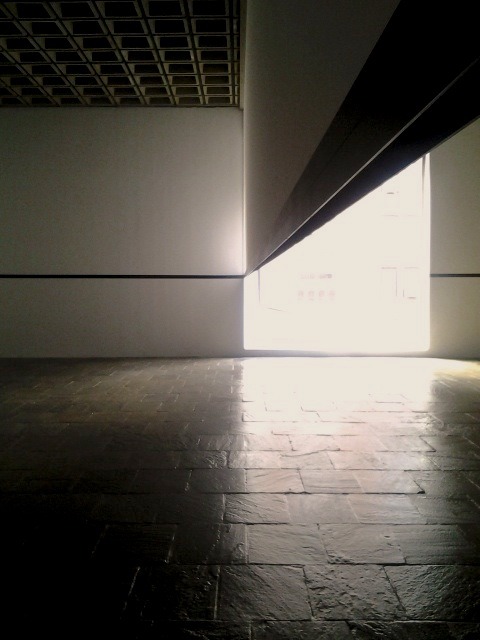
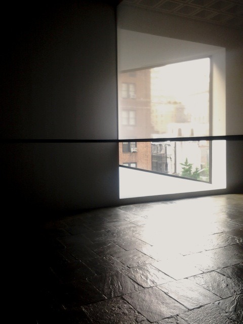
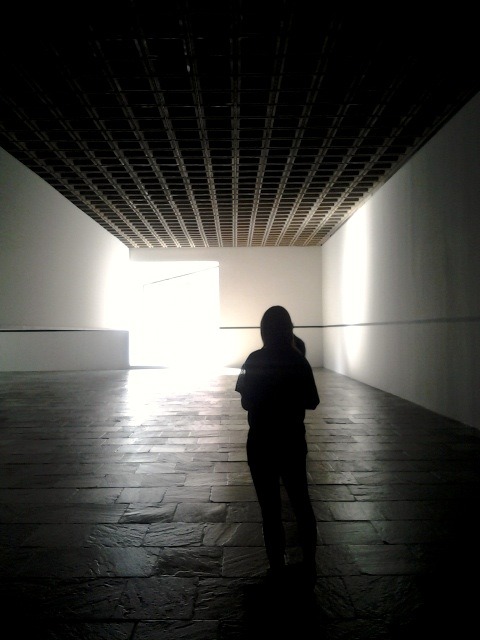
for this landmark irwin piece, an enormous room with an odd window at the whitney is installed only with a sheet of sheer fabric scrim, a black painted line, and a black-anodized aluminum bar. as you will not fail to notice, the room and its parts—walls, floor, scrim, bar—look different and unexpected with each new angle and change of light. the scrim, in particular, hovers between complete solidity and bare presence and snaps from one state to another with disarming ease. this is especially noticeable on a partly overcast day, with rapidly fluctuating light coming in the window. this is a worthy way to spend a new york afternoon. do not overlook the hockney video painting tucked in a dark corner two floors down, which takes the question "how can time figure into representative art?" and gives an answer that is unusual not only because it involves jugglers.

at the whitney, at least for the next few weeks.

* also relevant: olafur eliasson in the divine comedy.

Apr 20, 2012

gestural engineering

i'm reading, as i do every year, seeing is forgetting the name of the thing one sees, which is both a biography of robert irwin and an extended discussion of what it means to think about making a thing. the book is rich with interesting stuff for anyone willing to spend some time with it. it also represents a minor stream of thinking which currently appears scattered and diffused across many fields (computer science, organizational theory, design, manufacturing, and others): accounts of grasping not for mastery of a concrete thing but the abstract generative principle that produces concrete things of that class.

for instance, take arthur ganson. ganson is the MIT sculptor in residence, and the MIT museum has an ongoing exhibition of his work (note for cambridge residents: admission to the MIT museum is free today, 4/20, as part of the cambridge science festival). this is ganson's TED presentation (the embedded video will start at the beginning of the section transcribed below):


just as in robert irwin's work, there's a sense that there is a platonic ideal concept straining to emerge, that the process of making is a process of getting closer (but never close enough) to the realization in the real world of the idea in the mind:
i imagined a very simple gestural dance that would be between a machine and just a very simple chair. and when i'm making these pieces, i'm always trying to find a point where i'm saying something very clearly and it's very simple, but at the same time it's very ambiguous. i think that there's a point between simplicity and ambiguity, which can allow a viewer to perhaps take something from it. and that leads me to the thought that all of these pieces start off in my own mind, in my heart, and i do my best at finding ways to express them with materials. and it always feels really crude, it's always a struggle, but somehow i manage to get this thought out into an object. and then it's out there. it means nothing at all, this object just means nothing. but once it's perceived, and someone brings it into their own mind, then there's a cycle that's been completed. to me, that's the most important thing, because being a kid i wanted to communicate my passion and love and that means the complete cycle of coming from the inside, out to the physical, to someone perceiving it.
ganson has also posted footage of the performance of machine with chair, which includes the setup.

Sep 13, 2015

light effects

But most attractive to Seurat was the fact that at the viewing distance just before that where two complementary colours blend, the eye hovers on the verge of seeing two colors become one, and the paint surface seems to flicker as if luminous. This, Seurat believes, was how the artist could truly paint with light, capturing, for instance, the glow of sunlight on grass.
philip ball, bright earth

In the dot paintings, I took a large squarish canvas and painted it an even bright white ... Then I put on the dots, starting with very strong red dots, as rich as possible but only about the size of map pins, put them on very carefully, about one every quarter inch or so, such that they seemed neither too mechanically nor too crudely applied—either way they would have thereby drawn attention to themselves as patterns—concentrating them toward the center and then dispersing them less and less densely, missing one or two here and there, as they moved out toward the edge. Then I took the exact opposite color and put a green dot between every single pair of red dots, doing the same thing out to the edge, stopping the green maybe just a little before the red so that there was a slight halation of the two colors on the edge. But in the center they essentially canceled each other out, so that you didn't see either green or red but rather the energy generated by the interaction between the two.
more from irwin here.

Jun 29, 2012

part one

20120515_102748-1
robert irwin at pace (east 57th st, extended til 7/13/2012): a small show worth seeing. also the first retrospective i've seen featuring only new work. this is possible only if the work itself is an evolution of principles and approaches (the refinement of style or a function generator), rather than an accumulation of concrete pieces (a set of works or fixed points). in this way of thinking about development, late work is better for being both more and less: more comprehensive in representing elements of a style and including fewer elements that are extraneous.

the front desk was unamused by my suggestion that one of the white panels could stand a more rigorous cleaning. more on irwin here and here, and a nice little film about the retrospective here.

Apr 12, 2011

the divine comedy

the divine comedy is a frankly stunning collection of installations by ai weiwei (last year's unilever artist at the tate bankside, who has not incidentally been arrested (as of april 3) by the chinese government), tomas saraceno, and olafur eliasson (the 2003 unilever artist). having only been to the eliasson installations i can say that they are wondrous in a subtle and unsettling way (about which more below), but the collection of the three artists together is stunning because i cannot imagine how harvard pulled off something so cool without getting terminally stuck in the mud of bureaucracy and administration.

the eliasson installation deserves a fuller post in the future, after i've gone back when the lights are on. i stopped by tonight after a lecture/panel by david brooks and discovered that the installations are powered only between 8am and 5pm each day. this is extraordinarily lame because this series of installations, like much of the other work eliasson has done, explores our perception of light and visual stimulus and deserves to be explored in the off hours when the exhibition space is mostly empty of people.

i openly admit to being a philistine who visits museums because they have good light and great spaces rather than nice art. with few exceptions, i'm not much of a fan of figurative painting or other things like that. what i do like is art that requires technical sophistication in execution, a thorough understanding (even if not a formal one) of perception, and a bit of a sense of humour (even when this is not obvious). hence a deep and abiding appreciation of donald judd (more judd here), robert irwin, fred sandback, michael heizer, richard serra (more serra here), and all those other people. (dia beacon is a great place to go for these artists, not only because their works are concentrated there but also because the museum itself is jawdroppingly gorgeous. the renovation of the beacon building was supervised by ... robert irwin.)

eliasson's work falls into this category. rumour has it that his atelier is staffed by a relatively enormous team of fabricators, which may account for the intricate construction of some of the pieces i saw tonight. but not all the pieces in the divine comedy are extraordinarily expensive, complex, and intricate. what is most delighting is that the best piece is almost the simplest one.

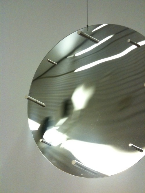
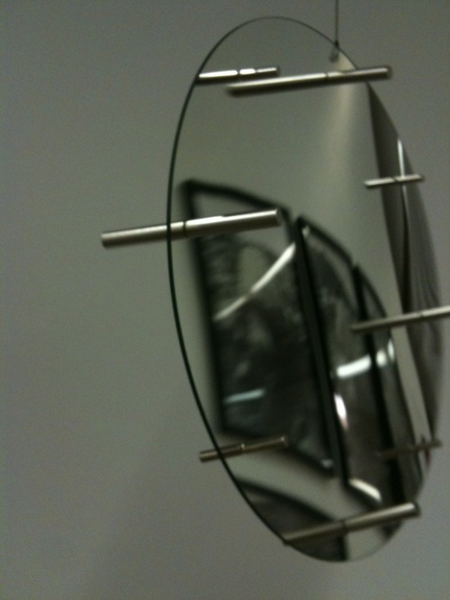
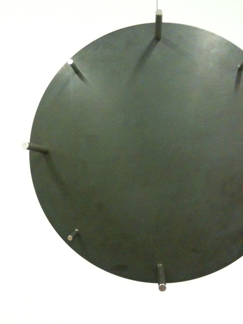
here are two views of it: one concave spherical section, mirrored on one side and penetrated around its edge with rods mounted exactly perpendicular to the surface at the points of mounting. the section is suspended by piano wire from the ceiling so that it rotates unpredictably and slowly. because the rods are perpendicular to the surface and close to the edge, their reflections are only minimally spherically distorted and connect with the non-occluded portion of the rod on the opposite side of the mirror. as such, they appear to penetrate through a clear piece of glass. however, when the section rotates to reflect a part of the room that has rectilinear objects in it, those relatively distant objects are considerably distorted, and the whole gives the appearance of what it actually is: a concave mirror. at other times, when the piece rotates to face a relatively featureless section of wall, it appears like a convex lens. the overall effect is of simultaneously perceiving a mirror, a lens, and a regular piece of glass at the same time; unsettling if you stop to think about it for even a moment. if he'd been able to make the section out of a much thinner material while still maintaining the concavity, the illusion and incongruity would have been total.

Photo Photo Photo_2

what's wondrous about the piece is that it forces the viewer to reconsider what an incredible exercise it is to interpret visual stimulus and come away with a snap identification of the thing being seen: a concave mirror, a piece of glass. donald hoffman's great and very accessible book on visual intelligence goes into some detail about the logic and processing behind these everyday miracles that happen in our heads, but eliasson's work (and especially that one piece described above) does so in the gentle, non-didactic, but insistent manner that is one of the hallmarks of great art.

eliasson is now chair of the Institut für Raumexperiment at the berlin university of the arts. this is a place i would like to visit.

Mar 5, 2009

robert irwin redux

the revised and expanded edition of seeing is forgetting the name of the thing one sees arrived today, together with trickster makes this world and the gift (both by lewis hyde). the new edition of seeing is printed on cheesy coated paper and has a cheesy cover that makes it look like a tourist guidebook (minus) but has the benefit of more colour plates of the fabled irwin experimental paintings which were, hitherto, never photographed (distinct plus). it remains one of the best books i've ever read about the cyclic nature of research and development.

in other news, spice tonight restored my faith in pad thai when i asked for it slightly spicier and with more ground peanuts than usual. by all accounts, it is totally inauthentic (is it possible to be totally inauthentic? is authenticity a binary state? anyway.) but it presses all the right buttons nonetheless--slightly sticky, sweet, sour, salty, crunchy, soft, chewy, smooth, spicy all at the same time.

also, for the first time here, the boston (but really mostly cambridge) companion to the san francisco map of good eats:

May 8, 2011

beginners

Nobody tells this to people who are beginners, I wish someone told me. All of us who do creative work, we get into it because we have good taste. But there is this gap. For the first couple years you make stuff, it's just not that good. It's trying to be good, it has potential, but it's not. But your taste, the thing that got you into the game, is still killer. And your taste is why your work disappoints you. A lot of people never get past this phase, they quit. Most people I know who do interesting, creative work went through years of this. We know our work doesn't have this special thing that we want it to have. We all go through this. And if you are just starting out or you are still in this phase, you gotta know its normal and the most important thing you can do is do a lot of work. Put yourself on a deadline so that every week you will finish one story. It is only by going through a volume of work that you will close that gap, and your work will be as good as your ambitions. And I took longer to figure out how to do this than anyone I've ever met. It's gonna take awhile. It's normal to take awhile. You've just gotta fight your way through.
ira glass, on telling stories (but really on everything)
this was posted and reposted everywhere, but that doesn't mean it's not worth reposting again. on this see jackson pollock, arthur ganson, and robert irwin

May 29, 2012

the essence of origami

I'm not trying to make a photograph, I'm trying to capture the essence, the impression of something. Some subjects I come back to over and over—cicadas, simple birds. I can do them in a different way and get ever closer to my mind's-eye image of what they ought to look like. You wouldn't think that origami could be reduced to equations, but some parts of it can. But the artistic aspect will never be captured in equations.
robert j. lang, "into the fold."
on which, also see arthur ganson, robert irwin, and the unknown craftsman.

Apr 22, 2012

the argument for quality

Artists need to be in there from the start, making the argument for quality. The key to this thing is, for example, if you give an engineer a set of criteria which does not include a quality quotient, as it were—that is, if this sense of the quality, the character of the place, is not a part of his original motivation—he will then basically put the road straight down the middle. He has no reason to curve it. But if I can convince him that quality is absolutely a worthwhile thing and we can work out a way in which the road can be efficient and also wander down by the river, then we essentially have both: he provides quality in that the road works, I provide quality in that it passes by the river. In that way, art gets built into the criteria from the beginning rather than being added on afterward. In many cases, it may not cost any more, or just a bit more, for the road to wander by the river. As opposed to, say, giving the artist one per cent afterward—which is, hell, just tokenism to the nth degree. The best they’re going to be able to do is put in a few doodads. But if you affect this whole process from the beginning by putting in place some quality criteria and you look around and ask yourself who in this society are trained to make this argument for quality, the only ones that I can think of are artists. We’re the only ones with no real rationale for being except developing aesthetics, or quality—we have no other function. So our key role in our society right now—and what we’re really talking about here is translating values into dollars—is for artists to make winning arguments for why considerations of quality are absolutely necessary.
robert irwin
in lawrence weschler's new yorker article "in a desert of pure feeling" [PDF

Feb 10, 2011

inside

Artists have always focused on their passions. The Greeks created images of the body, the Egyptians of their Pharaohs, the medieval painters of the Crucifixion, and the Impressionists of nature, color, and light. Modern artists do this, too, but their passions are no longer external. In this age we care about what is inside us.
jackson pollock
also see: arthur ganson, on getting the idea out of the head and into the world; and lawrence weschler, reporting robert irwin and frank stella.

Nov 27, 2015

australia


brilliant corners, kingsland road; ceryth wyn evans at white cube; wigmore street; manchester square; russ & daughters; robert irwin at white cube; lamb walk; shand street.

Feb 25, 2009

ideas in food

why do so few good cooks or chefs also write well? ideas in food embodies the philosophy of grounded, inductive, cyclic experimentation (much like robert irwin did), has really interesting ideas in food (and, of course, some quite beautiful photographs of those ideas realized), but the prose is turgid and pretentious to the point of unreadability.

elizabeth david, patience gray, and claudia roden (this fine new yorker article about her by jane kramer is well worth reading) all show that it can be done, and with grace besides. in case anyone thinks i only reference dead people, so does david patterson in this article for the nyt about the curious normalcy of san francisco food; particularly apropos since dinner club is planning an 7x7 blowout when i get there in march. (the anticipation is overwhelming.)

Nov 25, 2014

questions

I find it very precarious for a culture only to be able to measure performance and never to be able to credit the questions themselves ... As the questions go up, the performance level goes down—and that's natural, since people don't yet know how to act on those questions, they're stumbling around in a fog—whereas when performance goes up the quality of the questions tends to go down.

Dec 28, 2008

tara donovan at the ICA

after pestering miscellaneous individuals for months, i finally made it to the ICA today with hila, ariel, and hammer--just in time to catch the tara donovan show before it closes on january 4. her sculpture is usually made of prosaic materials (toothpicks, straws, styrofoam cups) but deployed in sufficiently enormous quantities that they lose that prosaic quality. the effect is amusing, deeply appealing, and wondrous. (here's her macarthur award citation.) time has a decent photo-essay that shows detail shots of her work, though the full effect of seeing her large pieces from afar is absent--most of the joy of approaching these works comes from the alienness of these shapes and forms from a distance, their familiarity of material only resolving when you get pretty close. exploring the materiality of things is what R&D art should be all about (for which, also see robert irwin's stuff).

i can't remember any sculpture i've seen recently either where the affect of the piece changes so dramatically and effectively at different scales of approach, except maybe the moss wall in the olafur eliasson show at SFMOMA.

detail of moss wall. photo from twi-ny on flickr.

my favourite piece from the ICA was haze which is not in the photo-essay; it is a wall of over a million plastic straws arranged horizontally. they'd been set down in bundles and allowed to spread out, contained only by the walls surrounding them. from a distance, the wall looked like a sheet of haze or foam; only when approached at a distance of 4-5 feet did the surface of the wall begin to shift, responding to even the slightest change of perspective. it was mesmerizing and delightful in the best possible way.

haze. photo from ace gallery.
detail of haze. terrible photo courtesy of ace gallery.

there was a wall filled with sheets of polyester film that really just defies description. from the side, it looked like an expanse of sandy material, but looked at straight on, with the light from the water-facing glass wall of the ICA coming from behind the installation, it became a random geometric arrangement of dark and light tan with the shadows of people behind the installation moving gently across it. there was a coral-like piece made of translucent buttons of various sizes epoxied together. ariel observed, accurately, that the thing looked permanently out of focus.

the piece that is probably the most photogenic, though without the chameleon-like quality of haze, is a ceiling-mounted installation of undulating topography made of thousands of styrofoam cups hotglued together. it makes you (or anyway it makes me) wonder why she doesn't try to use recycled materials more for this kind of thing.

untitled (styrofoam cups). photo from pace|wildenstein.

and we also had dim sum this morning. it is difficult--but not impossible--to have dim sum with jewish vegetarians.