
i saw helvetica last week; it's the gary hustwit film about the genesis of the typeface and how it became the juggernaut of the western typographical world. helvetica has so many variations (the official linotype page lists 68 separate faces in the family) that it's pretty easy to not notice how dominant it is in the visual landscape. as an inveterate type nerd, i found it refreshing to watch a documentary featuring interviews almost exclusively with people with whose work i am familiar: paula scher, michael bierut, stefan sagmeister, hoefler & frere-jones, erik spiekermann, david carson, hermann zapf, just to name a few.
there was a short but quite interesting section about how the design of neue haas grotesk (which is helvetica's original name -- not very sexy) was much more the product of eduarde hoffmann's input (he was the the director of the haas type foundry where neue haas grotesk was designed) than he is generally given credit for. these secret histories must permeate our world, and i appreciate any occasion on which they are brought to light. about this, more anon.
the best bits of the film were those times when the typographers being interviewed tried to explain their peculiar view of a world in which type is almost a spiritual element of the designer's toolkit, just like white space and texture. paula scher quite memorably (though in a distinctly tongue-in-cheek way) explained that in her mind, the relentless impersonality of helvetica was inextricably connected with the mindset that would send people off to the vietnam war. scher (like bierut) is one of the principals of pentagram, a design partnership worthy of adulation; when i was in new york in the summer, i saw a print of her atlas of the world that i was on the verge of purchasing except that i lacked $9800 (yes, even after a hefty discount). some of her great map paintings are viewable here.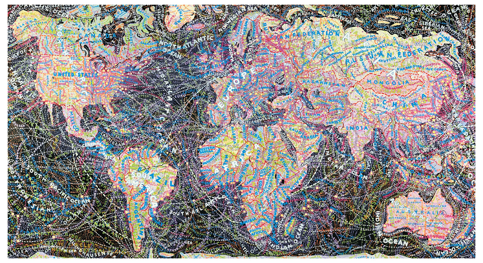
there will be little agreement among typographers about what good typesetting is and should do -- should it be a transparent vehicle for meaning or an expressive container for content?, and many other questions in a similar vein -- but most typophiles will probably agree that it is too easy to mistake tools and type for typography. taste in typography is a skill compounded of training and natural gift; the gift is rare, training not frequent enough, and the tools make it ever easier to set type absent gift or training without being a substitute for either.
in the film, a question frequently posed in one form or another is "why is helvetica so ubiquitous?" and erik spiekermann, designer of ff meta and not a proponent of helvetica, says in response, "why is bad taste ubiquitous?" much of the film became an exploration of typographical philosophy and variation in taste. david pye, in the nature and art of workmanship, talks about the quality of risk inherent in workmanship which calls forth a level of care in work that aims to mitigate the risk of loss of both material and time invested in material. a good illustrative example is mindfulness in cooking a bresse chicken, or in turning a rare piece of old madrone in order not to mess up the material with which you have been entrusted or lose the time spent in earlier steps of work.
risk of loss is a necessary prerequisite to careful work, and time and skill invested produces that risk; where large investments of time and skill relative to product are not required, production tends to be careless. one part of the answer to spiekermann's question is that bad taste is ubiquitous because carelessness is ubiquitous. in any case, we end on a cheerful note with a fine quote from eric gill's an essay on typography: "among the chinese, good writing is more highly honoured than painting is with us, as highly perhaps as we honour a successful contraption for boiling soap." is this the fate of art in the age of mechanical reproduction?
Jan 8, 2008
helvetica
![]()
![]()
Subscribe to:
Post Comments (Atom)
No comments:
Post a Comment